
Most product onboarding flows lose half their newly acquired users before those users reach their first useful outcome. The drop-off is the single largest leak in most product funnels, and most teams optimize the upstream acquisition channels for months before they look at the onboarding flow itself. By the time they do, the cost-per-acquired-user has gone up significantly because half the acquired users never activated.
The drop-off is not random. It tracks a small number of specific design failures that recur across product categories. Fixing those failures usually moves activation rate by 10 to 30 percentage points without any change in upstream acquisition.
This guide walks through what those failures are, what the design patterns that fix them look like, and how to instrument the flow so you can tell whether changes are actually working.

Photo by Muffin Creatives on Pexels
Where Users Actually Drop Off
The instinct is to assume drop-off happens at the friction points -- the long forms, the credit card collection, the email verification. Those points do cause drop-off, but they are not where most of the loss is concentrated.
The largest single source of drop-off is at the moment the user finishes signing up and is shown the empty product. They have created an account, but the product is empty, they do not know what to do next, and the path to the first useful outcome is not obvious. They close the tab and never come back. The signup data and the analytics suggest they "activated" because they completed signup, but they never used the product.
The second largest source is during the first task. The user knows what they want to do, the product is asking them to do something else first, and the something-else is annoying enough that they bail. A common pattern: the user wants to send their first invoice, and the product is requiring them to configure tax settings, connect a bank account, and complete a profile before they can do anything.
The third largest source is when the first task succeeds but the user does not see the success. The product completed the action silently, the user is not sure whether it worked, and the lack of feedback feels like the product is broken.
Each of these has a different design fix, and the fixes are not interchangeable.
Fix 1: Show a Filled Product, Not an Empty One
The empty-state problem is the most common cause of post-signup drop-off. The product has nothing in it because the user just signed up, so every screen shows "no data yet" and the user has no model for what success looks like.
The fix is to fill the product with realistic-looking sample data on signup. The user sees what an active account looks like -- some projects, some entries, some history -- and can either explore the sample data to learn the model or replace it with their own real data when they are ready.
The Nielsen Norman Group has published research on empty-state design that consistently finds filled products outperform empty ones for first-time user comprehension. The pattern works across product categories: project management tools, CRMs, analytics dashboards, design tools.
Implementation note: the sample data should be obviously sample data, clearly labeled, and easy to delete in a single action when the user is ready to add their own. Sample data that looks real and is hard to remove creates a different problem -- users worry they accidentally invited strangers or imported the wrong data.
Fix 2: Defer Configuration Until the First Real Use
The configuration-first pattern is endemic to enterprise-leaning products. The user signs up to send invoices, manage projects, or run reports, and the product asks them to configure currency settings, time zones, team structures, billing details, and notification preferences before they can do anything useful.
The fix is to defer every configuration choice until the moment it actually matters. The user wants to send their first invoice; let them send it with sensible defaults and surface the configuration questions only when those defaults are about to produce a problem.
If the default currency is wrong for this customer's invoice, surface the currency dropdown on the invoice screen. If the team structure matters for the project the user is creating, ask about it when they create the project. Asking about everything up front, before the user has any context for why the questions matter, is what produces the drop-off.

Photo by Wolf Art on Pexels
The pattern translates across product categories. The W3C accessibility guidance related to user-centered design emphasizes progressive disclosure -- show what the user needs when they need it, not when the product wants to ask.
Fix 3: Make Successful Actions Visible
Silent success is one of the most common usability failures in modern web products. The user clicks "save" or "send" or "submit", the action completes, the screen does not change, and the user is left wondering whether anything happened.
The fix is explicit feedback for every state-changing action. A toast notification, a state change in the UI, a brief animation that confirms the action -- the specific pattern matters less than the fact that the user can tell the system processed their input.
Loading states matter too. Any action that takes more than 200 to 300 milliseconds should show a loading indicator. Without it, users assume the click did not register and re-click, which on some products creates duplicate actions and on most products creates frustration.
The MDN Web Docs reference on UI patterns covers the technical implementations of toast notifications, loading states, and transition animations. The specific implementation matters less than the principle: every action the user takes should produce visible feedback.
Fix 4: Design the First Task End-to-End Before Anything Else
The single highest-leverage exercise in onboarding design is to write out the first task the user actually came to the product to complete, then count every click, decision, and screen between the signup page and that task being done.
For a project management product, the first task is usually "create a project and add a task to it". Count the screens between signup and "task added". If the answer is more than 4 or 5, the flow has too much in front of the first useful outcome and the drop-off rate will be high.
The exercise frequently surfaces decisions the team made early in the product's life that no longer serve the user. The profile completion screen that the founder added in month two because they wanted user data. The team invitation screen that came from a partnership the company no longer has. The tutorial overlay that someone added in month six and never measured.
The 137Foundry team regularly works on onboarding redesigns for B2B SaaS products, and the most common finding is that the onboarding flow has accumulated 18 to 36 months of incremental additions, each defensible in isolation, that collectively push the first useful outcome too far from signup. The fix is rarely adding new screens. It is removing existing ones.
Fix 5: Build Instrumentation Before You Redesign
The instinct is to redesign first and measure second. This produces redesigns that look better but do not necessarily perform better, because the team has no baseline for what was actually broken in the original flow.
The right sequence is to instrument the existing flow first. Measure drop-off at every step. Identify which steps account for most of the loss. Then redesign the high-loss steps specifically, leaving the rest of the flow alone.
The instrumentation should capture more than just step completion rates. Time-to-action on each screen tells you whether users are confused (long time) or skipping (short time and then exit). Error rates on form steps tell you whether the validation is working or whether it is rejecting legitimate input. Heat maps on screen content tell you whether users are seeing the calls to action.
The Google web fundamentals documentation on user experience measurement covers the metrics that matter for activation funnels. The key insight is that activation is a multi-step funnel, not a single conversion, and each step needs its own measurement.
A Practical Sequence for Onboarding Improvement
A reasonable approach for redesigning an existing onboarding flow:
First, instrument the existing flow with per-step drop-off measurement. Run for at least 2 weeks to get a stable baseline across day-of-week variation.
Second, identify the top 3 drop-off points. Resist the urge to fix everything at once -- changes are easier to attribute when you make them one at a time.
Third, for each top drop-off point, write out the user's likely mental state on that screen. What are they trying to do? What is the product asking them to do instead? Why might they be leaving?
Fourth, redesign the highest-loss step specifically. Use the patterns above as a starting point, but the specific fix depends on which design failure is producing the loss.
Fifth, ship the change to a fraction of new signups (10 to 25 percent), measure for 2 weeks, and compare against the unchanged control group. Statistical significance matters; one week of data on a small change is not a credible signal.
Sixth, if the change moves the metric, ramp it to all users and move to the next drop-off point. If not, revert and try a different fix on the same step.
"Most onboarding flows are full of decisions someone made years ago for reasons that no longer apply. The biggest improvements usually come from cutting screens, not adding them." - Dennis Traina, founder of 137Foundry
The Patterns That Do Not Work
Several patterns that look helpful in design reviews tend to underperform in production data.
Tutorial overlays that walk the user through every feature on the screen are widely disliked. Users want to use the product, not learn it. Overlays that interrupt the user with information they did not ask for are skipped, and the skip pattern often correlates with the user closing the tab entirely.
Forced video tours produce the same problem. The user came to the product to do something specific; a 90-second video is 90 seconds of friction between them and the thing they came to do. Optional video tours are fine. Forced ones are not.
Email-gated unlocks where the user signs up but cannot access the product until they verify their email turn email verification into a major drop-off point. Some products need verification for security reasons; most do not need it on signup. Allow access immediately, ask for verification at a moment when it matters (sending an invoice, inviting a team member).
The Smashing Magazine editorial archive includes case studies on each of these patterns and what production teams found when they measured the impact of removing them.
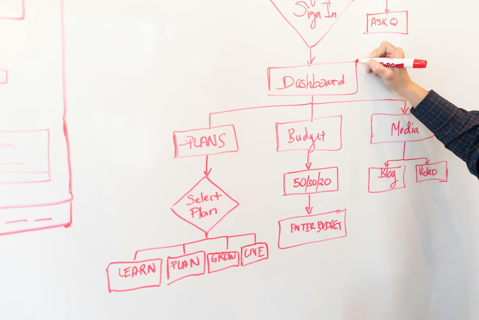
Photo by Christina Morillo on Pexels
Where AI-Generated Onboarding Recommendations Fall Short
The current generation of AI design tools is good at generating onboarding mockups but consistently misses the harder design judgments. The tool can produce a clean-looking signup screen and a tutorial overlay, but it does not have access to the activation data that would tell it whether the design is solving the right problem.
The design judgments that matter -- which question to defer, which sample data to pre-fill, what the first useful outcome actually is -- require knowing the product's specific user base and what those users came to do. Generative tools can produce candidate designs faster than a human can, which speeds up iteration, but the strategic judgment about what to design still has to come from someone who understands the product.
Closing Note
Onboarding design is one of the highest-leverage areas in product work because the cost of fixing it is low and the impact on every downstream metric is large. A 10-percentage-point improvement in activation rate flows through to retention, revenue, and lifetime value at the same multiple, and the cost is usually a few weeks of design and engineering work.
The patterns above are not exhaustive. They are the ones that recur most often across the products we work on. The services we offer at 137Foundry include onboarding flow audits for SaaS and B2B products, and the about page covers our approach.
Most onboarding flows can be meaningfully improved in 4 to 8 weeks of focused work. The improvement is usually not from making the existing flow prettier; it is from cutting the path between signup and first useful outcome until users have a chance to actually experience what they came for.