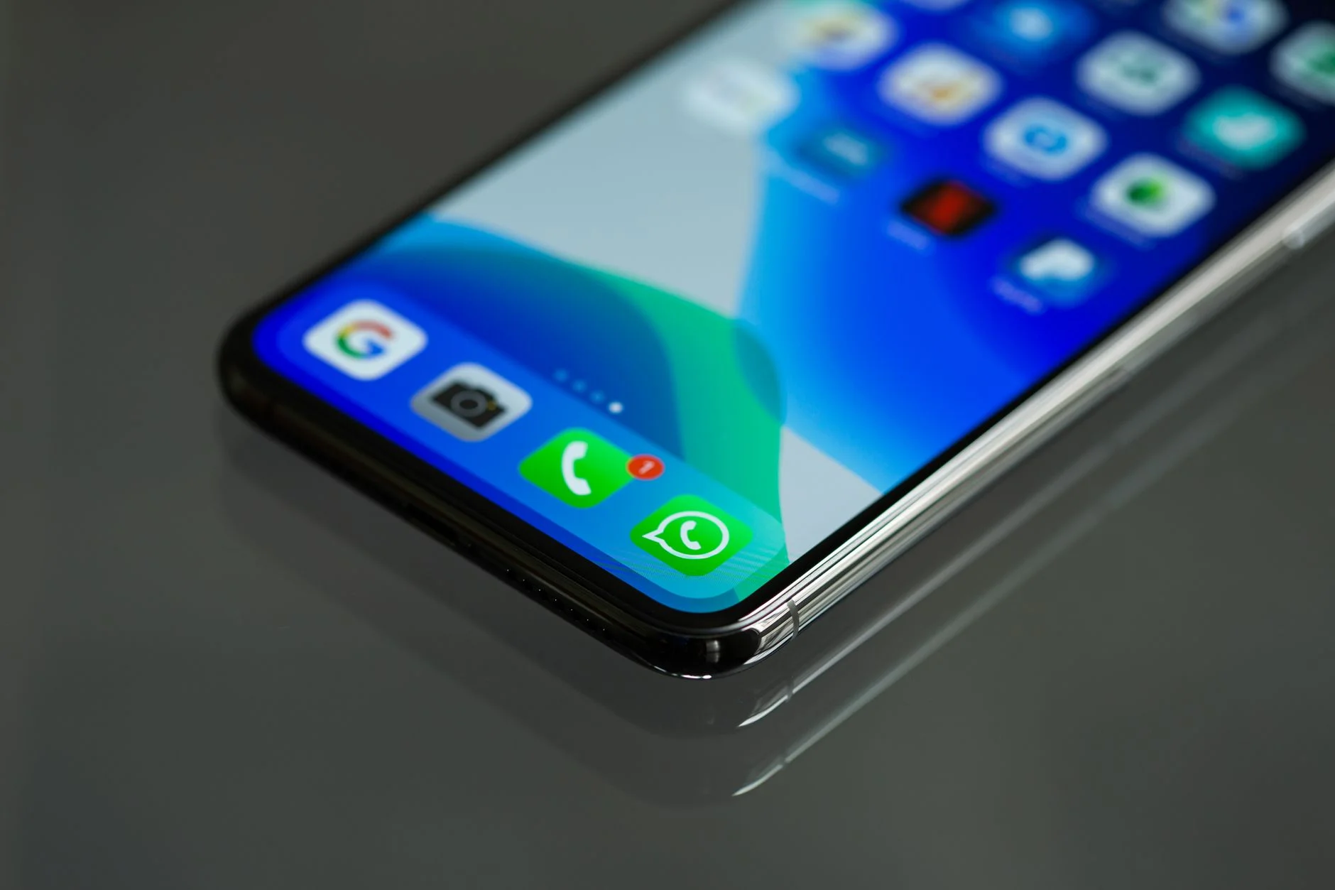
Open almost any web app and you'll find a notification system that was clearly built in an afternoon. A toast slides in from the corner, sits there for some arbitrary number of seconds, and slides back out. It works fine in a demo with one notification. It falls apart the moment three things happen at once, or a screen reader user hits the page, or someone glances away for two seconds and misses the only copy of an error message they needed.
The problem is rarely the animation. It's that most teams design the visual container before they design the actual information architecture behind it. Success messages, destructive-action warnings, and background sync updates all get dumped into the same queue with the same five-second timer, and users learn fast that ignoring the corner of the screen costs them nothing.
None of this is exotic to fix. It just requires treating notifications as a system with rules, not a component you drop in once and forget. The rest of this guide covers message categories, timing, queuing, and what breaks quietly for users who rely on a screen reader.
Start With What Kind of Message This Actually Is

Photo by RDNE Stock project on Pexels
Before touching layout, sort every notification your product sends into a small number of categories, because each one earns a different behavior:
- Confirmations - "Changes saved." Low stakes, safe to auto-dismiss quickly.
- Warnings - "This will delete 40 records." High stakes, should never auto-dismiss silently.
- Errors - "Upload failed." Needs to persist until acknowledged or the underlying problem is fixed.
- Background updates - "3 new comments." Informational, not time-sensitive, fine to batch.
The Nielsen Norman Group has written extensively about how users scan interfaces for signal, and the short version is that a UI which treats every message with identical visual weight teaches people to stop reading any of them. If a typo-fix confirmation and a data-loss warning look the same, the warning loses.
Color and iconography should map to these categories consistently across the whole product, not per-team or per-feature. A green check for confirmations, an amber triangle for warnings, and a red icon for errors sounds obvious, but it's common to find three different visual languages for "something went wrong" inside the same app once enough teams have shipped their own toast component independently.
Timing Rules That Actually Hold Up
A flat five-second timer is the most common mistake in notification design, and it's wrong for almost every category above. A better baseline:
- Confirmations: 3 to 4 seconds, auto-dismiss, no action required.
- Informational updates: 5 to 8 seconds, or until the next one replaces it.
- Warnings and errors: no auto-dismiss. Require an explicit close or resolved action.
- Anything with an undo action: at least 6 to 8 seconds, since the reader has to read the message and decide whether to act.
Reading speed matters more than most timers account for. If a message is more than about ten words, the default duration needs to scale with length or a chunk of readers will lose it mid-sentence.
If your team has analytics on the notification component, check how often users dismiss a toast manually before the timer runs out. A high manual-dismiss rate on informational toasts usually means the timer is too long; a near-zero rate on anything important usually means people never looked at it.
Stacking and Queuing Multiple Notifications

Photo by Wolf Art on Pexels
The moment a second notification fires while the first is still visible, most homegrown systems either stack them awkwardly on top of each other or silently drop one. Neither is acceptable in a production interface.
A workable pattern:
- Cap visible notifications at two or three at a time.
- Queue the rest and reveal them as space clears, oldest first unless a higher-severity item should jump the line.
- Collapse near-duplicate low-priority items ("Saved" fired three times in two seconds becomes one badge, not three toasts).
- Never let a warning or error get pushed off-screen by newer confirmations. Severity should always win the stacking order.
Material Design's guidance on snackbars is a decent reference point here even outside a Material-based product, mainly because it forces a decision about how many can be visible before the system has to queue rather than pile.
Stacking order also needs to survive a layout shift. Notifications that push page content down (rather than overlaying it) are friendlier to read but can cause a jarring jump if a form field the user is focused on suddenly moves. Overlaying avoids that at the cost of occasionally covering content, so the right call usually depends on how dense the rest of the layout already is.
Notifications Have to Work Without Sight, Too

Photo by Towfiqu barbhuiya on Pexels
This is the section most teams skip, and it's the one that determines whether the feature is actually usable rather than just visually finished. A toast that appears silently and vanishes in five seconds is invisible to a screen reader user unless it's implemented correctly.
Practically, that means:
- Use an ARIA live region (
aria-live="polite"for routine updates,assertivefor errors and warnings) so assistive technology announces new messages without requiring focus to move. - Never rely on color alone to signal severity. Pair red or amber with an icon and a text label.
- Give every dismiss control a real accessible name, not just an X glyph with no label.
- Respect
prefers-reduced-motionfor the slide/fade animation. Vestibular disorders are common enough that "polish" shouldn't come at the cost of usability.
The W3C's Web Accessibility Initiative and WebAIM both maintain solid reference material on live regions and announcement timing if your team hasn't implemented one before, and MDN documents the underlying ARIA attributes if you need the technical reference while building it. It's a small amount of markup for a large amount of usability.
One detail worth calling out separately: aria-live="assertive" interrupts whatever the screen reader is currently announcing, which is exactly right for a destructive-action error and exactly wrong for a routine confirmation. Using it everywhere because it "feels safer" ends up being more disruptive than using no live region at all.
Mobile Changes the Rules Again

Photo by Julio Lopez on Pexels
A notification pattern that works on a 1440px desktop viewport often breaks on a phone. Screen real estate is scarcer, thumb reach limits where dismiss controls can sit, and the OS itself already owns a notification channel your users associate with different expectations.
A few adjustments that hold up in practice:
- On mobile, favor a single persistent notification area (often bottom of screen, above any tab bar) over corner toasts that can get clipped by browser chrome.
- Keep mobile copy shorter. The same message that reads fine at 400px of desktop width wraps awkwardly and eats more vertical space on a phone.
- Swipe-to-dismiss is a reasonable pattern on touch devices, but it needs a non-gesture fallback (a visible close button) for accessibility.
Also worth separating clearly: in-app toasts and OS-level push notifications are not the same channel and shouldn't be designed as if they are. A push notification competes with every other app on the device for a glance of attention and needs to justify itself on its own; an in-app toast only has to compete with whatever else is on that one screen. Reusing push notification copy verbatim inside the app (or the reverse) usually reads as either too aggressive or too vague for its actual context.
Undo Beats Confirmation Dialogs More Often Than Teams Assume
A recurring anti-pattern is defaulting to a blocking confirmation dialog ("Are you sure you want to delete this?") for every destructive action, which trains users to click through them without reading. For anything reversible, a notification with an inline undo action is usually the better call: the action happens immediately, and the notification itself becomes the safety net.
"The best confirmation is one the user never has to think about because they know they can undo it. Confirmation dialogs stop being a safeguard the moment people start reflexively clicking through them, and by then they're just friction with no upside." - Dennis Traina, founder of 137Foundry
This only works if the undo window is long enough to be usable (8 to 10 seconds minimum) and the action it reverses is actually reversible on the backend, not just on the screen. If the delete already fired an irreversible API call the moment the button was clicked, the undo button is decorative, and that gap between what the UI promises and what the backend actually does is where trust in the whole notification system erodes fastest.
Common Mistakes Worth Naming Directly
A short list of patterns that consistently cause trouble in production:
- Auto-dismissing errors. If a user needed to read it to fix something, it can't disappear on a timer.
- Stacking without a cap. Five toasts piled on top of each other is not a queue, it's a wall of noise.
- No persistent log. Once a toast disappears, there's often no way to review what it said. A lightweight notification history (even a simple dropdown) solves this cheaply.
- Treating every message as equally important. This is the root cause of most of the problems above, and it's a content decision before it's a component decision.
- Writing copy after the component ships. When the toast text gets written last, it tends to default to raw error strings from the backend instead of something a person would actually understand.
Building This Into an Existing Product
Retrofitting a notification system is usually less about the component library and more about auditing every place in the codebase that currently fires a message and re-sorting them into the categories above. That audit alone tends to surface duplicate or contradictory messages nobody noticed because they were all wearing the same five-second toast costume.
A practical rollout path: build the categorized system alongside the old one, migrate the highest-traffic flows first (usually forms and destructive actions), and measure whether support tickets referencing "I didn't see the error" actually drop before declaring the migration finished. That's a more honest signal than a design review sign-off.
If your team is planning a UI or frontend overhaul, this is a good piece to fold into a broader web development pass rather than patching it in isolation. 137Foundry's UX and web development team takes on this kind of interface work directly, and the about page has background on who's doing it.
The Short Version
Sort messages by what they actually need from the user before picking timers or animations. Confirmations can be quick and quiet. Warnings and errors need to persist until acknowledged. Everything needs to work through a screen reader, not just visually. And undo, done well, usually beats another confirmation dialog. Get that ordering right and the toast component itself becomes the easy part.