Most UX research failures are not failures of methodology. They are failures of prioritization. Teams skip research not because they think it is unimportant but because they believe it requires resources, timelines, or expertise they do not have. The result is products built on assumptions, launched, and then expensively revised after real users encounter problems that a few interviews would have surfaced.
The good news is that meaningful UX research does not require a dedicated research team or a six-week study. It requires commitment to asking questions before building, and the discipline to act on what you find. The methods below are practical, fast, and accessible to teams of any size.
User Interviews: Five Is Usually Enough
The most common misconception about user interviews is that you need dozens of them to learn anything reliable. Jakob Nielsen's landmark research on usability testing demonstrated that five participants can uncover approximately 85 percent of a product's usability issues. That research applies broadly to formative research - the kind done to understand problems before building solutions.
The goal of a user interview is not statistical significance. It is pattern recognition. When three out of five users describe the same confusion around a feature, that is a pattern worth addressing. When one user mentions something the others do not, it is worth noting but not worth redesigning for.
Recruiting participants does not require a research panel. For B2B products, your sales team's contact list is a research pool. For consumer products, social media posts offering a modest gift card for 30 minutes of their time consistently find willing participants. The important thing is that participants match the actual profile of your intended users, not your internal team's assumptions about users.
Structure matters more than most people expect. Unstructured interviews produce anecdotes. Semi-structured interviews - with a prepared list of open-ended questions that you are willing to deviate from when something interesting comes up - produce insight. Always start with context questions (tell me about how you currently handle X), move to specific task questions (walk me through the last time you needed to Y), and end with open-ended reflection (what would make this significantly easier).
Never ask users what they want. Ask what they do. Users are unreliable predictors of their own behavior but highly accurate narrators of their past experience.
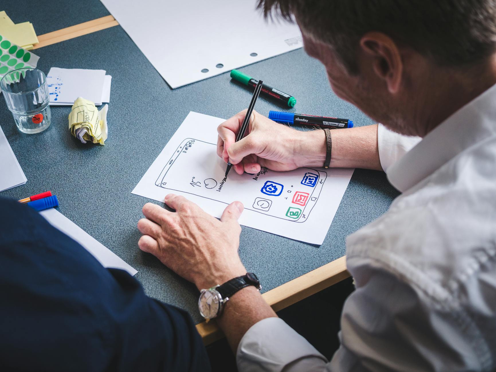
Photo by Fabian Wiktor on Pexels
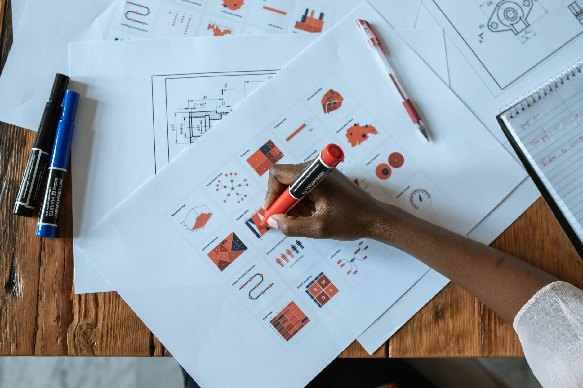
Card Sorting for Navigation and Information Architecture
Navigation problems are among the most common usability issues found in audits, and they are also among the most preventable with simple research. Card sorting is a method that reveals how users mentally categorize and group information - which is the foundation for any navigation or information architecture decision.
In an open card sort, participants receive a set of cards with content items written on them and are asked to group them however makes sense to them, then name each group. The results show how users think about your content domain, which is often quite different from how the organization thinks about it.
In a closed card sort, the category names are provided in advance and participants sort content into those categories. This validates whether a proposed navigation structure makes sense to users before you build it.
Tools like Maze, Optimal Workshop, and UserZoom handle card sorting with small sample sizes effectively. Even a physical card sort with printed index cards and a willing participant produces useful signal. The goal is to find patterns in how different users group the same content, which reveals where your proposed structure aligns with mental models and where it conflicts.
Particularly useful: run a card sort with your team first, then compare results to actual user sorts. The gaps between internal assumptions and user behavior tend to be instructive and humbling in equal measure.
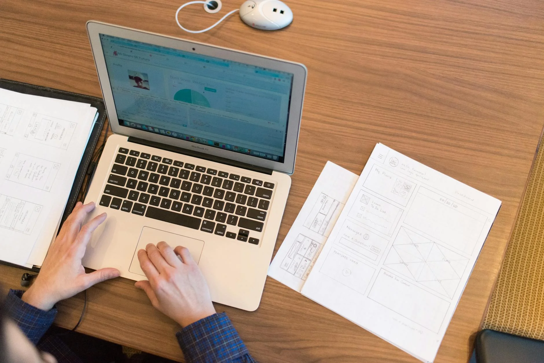
Usability Testing on a Budget
Usability testing - watching real users attempt real tasks with your product - is the highest-signal research method available to most product teams. It consistently surfaces problems that designers and developers cannot see because familiarity blinds them to friction they have long since stopped noticing.
Moderated usability testing means watching and asking questions in real time. It requires a facilitator, a participant, and either a shared screen or in-person session. Think-aloud protocol - asking participants to narrate their thoughts as they work through tasks - is the simplest and most effective way to understand what is happening in the user's head when they encounter friction.
Unmoderated testing uses tools like UserTesting.com, Maze, or Lookback to send tasks to participants who complete them asynchronously and record their screen and audio. These sessions are faster to recruit for and analyze, though you lose the ability to probe interesting moments in real time.
For both approaches, task design matters significantly. Tasks should be realistic and goal-oriented, not step-by-step instructions. "Find a plan that works for your team's size and sign up for a trial" is a good task. "Click the Pricing tab and then click the Team plan" is not. The second version is testing whether users can follow instructions, not whether they can accomplish goals.

Photo by Eduardo Rosas on Pexels
Five to eight participants per round of testing is usually sufficient to identify the most significant usability problems. Test early - on prototypes or even paper wireframes before any code is written - and test again before launch. The cost of finding problems in a prototype is a fraction of the cost of finding them after release.
Heatmaps and Session Recordings
Quantitative behavior data - where users click, how far they scroll, and where they move their cursor - complements qualitative interview data by showing what users actually do rather than what they say they do. Heatmaps aggregate interaction data across many sessions into visual overlays that reveal patterns quickly.
Click heatmaps show where users attempt to click, which includes "rage clicks" on elements that look clickable but are not. Scroll heatmaps show how far down the page users typically read, which is directly relevant to decisions about where to place key content and CTAs. Move heatmaps approximate where users are looking, though they are less precise than eye-tracking studies.
Session recording tools like Hotjar, Microsoft Clarity (free), and FullStory capture individual user sessions and allow playback. Watching 10-15 sessions of users encountering a specific page or feature is often enough to identify the most common friction points without any additional recruitment.
Both types of data are most useful when you have a specific question. "What is happening on our checkout page that causes abandonment?" is a good frame for session recording analysis. Browsing recordings without a question produces interesting observations but not actionable findings.
Surveys at the Right Moment
Surveys are frequently overused for UX research and frequently deployed at the wrong moment in the user journey. A survey asking new visitors what brought them to the site is useful. A survey asking users mid-task to rate their experience is destructive to both the research and the user's experience.
The most effective placement for UX surveys is immediately after a completed or abandoned action. A post-checkout survey asking a single question - "Was there anything confusing or frustrating about this process?" - captures feedback while the experience is fresh and after the user has already converted, so the survey does not interfere with the goal.
Exit intent surveys on key pages can capture abandonment reasons, though they require careful implementation. A modal survey that fires after 30 seconds on a page regardless of what the user is doing is annoying. A survey that appears when a user's cursor movement suggests they are about to leave a checkout or signup page is contextually appropriate.
Keep surveys short. Three questions maximum for in-product surveys, five for post-completion surveys. Each additional question reduces completion rates substantially. If you need to ask 12 questions, that is a user interview, not a survey.
Turning Research Into Product Decisions
The value of research is proportional to how well it is integrated into the design and development process. Research findings that are documented in a shared location but not referenced in design reviews add overhead without changing outcomes.
Effective integration looks like this: a round of usability testing produces a prioritized list of problems ranked by frequency and severity. Those problems are reviewed in a design sprint or sprint planning session. The highest-priority issues are assigned to specific upcoming sprints. Research is not a phase that precedes design. It is a continuous input into design decisions.
Teams that want to move faster on both research and implementation benefit from working with partners who understand both domains. The web design team at 137Foundry combines UX research with development, which reduces the handoff friction that often exists between research findings and actual product changes.
For deeper reading on research methods, the Nielsen Norman Group's research articles at nngroup.com/articles cover every method described here in significant depth. Rosenfeld Media publishes the most thorough books on information architecture and research methodology, including Lou Rosenfeld's work at rosenfeldmedia.com. For accessible how-to guides on specific methods, the Interaction Design Foundation at interaction-design.org is a reliable reference.
The most important thing about UX research is starting. Imperfect research conducted quickly beats perfect research planned indefinitely. Five user interviews this week will change how your team thinks about the product in ways that no internal discussion can replicate.
The 137Foundry about page covers more about our approach to design and development work if you want context on how these principles translate to real project work.